Tag: Art

To tell the story of the performance you would have to do a deep dive yourself! The now pretty legendary performance of Mark Gonzales in Germany is one of skateboarding’s shining moments. But what does it mean… what changes if you repeat the work?

Artists have argued that every time you duplicate/execute a performance or work of art it is, in fact, a new work of art. A moment can never be recreated so every moment is a moment in and of itself. If we hold that to be true the spectators of Mark’s 2018 performance witnessed something singular, something new.

adidas, together with Mr Gonzales also made a shoe, based on the original fencing shoe that Mark wore in the performance in Germany.

The original was a fencing shoe this one is a skate shoe based on a fencing shoe. skating non-skate shoes is a tradition in skateboarding. And in this case, the result is very nice indeed!

https://vimeo.com/227595987

Blondey McCoy unveils Us and Chem. as his fifth solo show. If you happen to be in London these days, make sure to go to:

Heni Gallery, 6-10 Lexington Street, Soho
from July 27 to August 27, 2017.
Monday – Sunday: 10-6pm.

“In feeling blue, tragically, the natural thing to do is stay blue. The creating of these new works has proven to me, more than ever before, that expressionism and making artwork is a way of temporarily exorcising that feeling. The show was created out of a compulsion to create, not one to show off, throw a party or make money. It’s making has been a revelation in accepting the need to treat bipolar as a blessing rather than a curse, and to perpetually guarantee myself that from long hum drum periods of heightened sensitivity, my most genuine and life affirming artwork is born.”
Words by Blondey McCoy.

“As a little boy, I used to wonder how people know how much milk they have to pour in their coffee for it to be the way they want it to be. More precisely, is the color of the coffee actually related to its taste and its strength? Life went on and enigmas of this type got solved by themselves: You pour the milk and hope for the best. By doing it every morning, you just get the flow. Nowadays, I don’t even need a timer to cook pasta anymore. I just try the spaghetti when I feel like it might be good.

Anyways, things look the same way on a larger scale: You ask yourself how to lead this tyrannic symphony of existence involving girls, getting enough sleep, washing dishes, skateboarding, paperwork, friendships, the past, the present, the future, online banking, buying new socks, career, trying to be cool, healthy food, holidays, girls, skateboarding, the future etc. Good thing is that in the end it all happens by itself and you just pour the goddamn milk, worst case scenario is that you end up with some kind of latte macchiato.

And now, here’s a little video that may be useful if you ever happen to need a life-coach.”

Last week our trusted companion Danny Sommerfeld exhibited his work at COMA (Container Of Modern Art). He also presented to the world his latest project called (SOMMER), which is basically a tool for Danny to connect his photography to a disposable product like a skateboard. So about a week ago Danny went off to München with his bags packed, his photos printed, three rolls of film and he came back with “this”.

What is “this” you might ask yourself, this is what we call a meta-work. What is a meta-work!? you might ask. Well let me put it this way, on one side this is a recap of Danny’s time in München, at the same time, Mr. Sommerfeld twisted the whole thing around by encapsulating all the images into a concept.

The concept being that you are looking at three rolls of film, every roll starts with a contact sheet (like you get when you develop a roll of film a camera store.). In this Kaffeezigarette, Danny presents us with 3 rolls of film, many moments, shot in 1 city and all of that is connected by this 1 idea.

So instead of simply giving you a review of events, you get a review packaged into something new. Enjoy.

ROLL 1


ROLL 2


ROLL THREE


If you want to see the exhibition you still can check here for info.

All photos by Danny Sommerfeld.

Our very own dog Danny Sommerfeld just launched his website! On his piece of web space, you can take a virtual tour through his PLACE projects, his autonomous works and more. Basically, you will be able to sneak peek into his doggy brain.

To celebrate this event Danny delved into his archives and created something new out of something old, Upcycling his own work so to speak. All jokes aside though we have seen Danny learn a lot and transform his work into something worth looking at longer than your average picture

Click here to visit Danny’s website.

Click here for all the Kaffeezigarette posts.

We would like to proudly introduce our newest columnist Franz Grimm! For those who follow our moves, Franz is no stranger, we met him last February in Paris while we were out there working on the Paris/Paname issue. In that issue, he had one of the most beautiful pictures and ever since that trip we stayed in touch. Born in Berlin, raised in Paris, an “In Between” kinda guy. Thus it felt only logical to call his column “In Between Tries”. Franz is a person who is German in France and French in Germany. I could give more examples but let’s leave something for the viewer to find out. So without further ado, we are happy to Introduce our newest columnist and column “In Between Tries” and as for this first column called “If My Mind Was A Laptop.” I will let Mr. Grimm explain that one.

A few years ago, my brother Tibor was told he looked like Evgeni Plushenko, a famous Russian figure skater. I googled the name and watched Plushenko’s footage on Youtube and I found out they do look-alike.
At first sight, I thought figure skating is really badass. Absurd skills, fluidity, creativity and speed. These performances on the ice seemed like lines in skateboarding to me: some flowing moves with tricks and rotations in between.
Anyways, a couple days back it all came back to me and this is what my mind would look like on a laptop since then.

Paving Space is a contemorary art project by Raphaël Zarka that takes advantage of the nature of skateboarding to function very well with geometrical figures. Inspired by mathematician Arthur Moritz Schoenflies’ three dimensional models, Raphaël Zarka built sculptures that consist of different geometrical components that enable to create innumerous compositions. However these sculptures can already be seen as art by themselves, Raphaël Zarka adds the motions of skateboarding to his geometrical structures, which, in turn, opens up a complete new field of compositions because every skateboarder skates a certain obstacle in an own way.

Featuring Sylvain Tognelli, Nick Jensen, Casper Brooker, Jan Kliewer, Joseph Biais, Rémy Taveira, Josh Pall, Chris Jones and Armand Vaucher.

For this video Magenta’s Soy Panday and UNI teamed up and created something nice! If you ever put up a tag, went to art school or another creative industry chances are that you had a Posca in your hand, we often use them to customize our shoes. As for Soy Panday he makes us feel Bob Ross chill, so maybe he should consider doing more of these videos.

Poetic Collective is a brand that is trying to do things in their own way, the name of the company suggests that there is a group of people working on the project and that is the truth. The company has its roots in the art world with multiple artists or art students contributing to the collective look and feel. We had a talk with Tom Botwid about Poetic’s new collection, their team riders, the nostalgic vs. the contemporary, and drawing inspiration from outside of skating. We are happy to present their new collection together with Tom who provides some extra context to the whole thing. Enjoy!

This is your sixth collection isn’t it?
So much has changed from our first collection up until now I am sitting in my apartment right now and I have a board from each collection and the first one only had one t-shirt and one board and I did that while I was still studying art in Berlin. There I was making a lot of things that were very conceptual and I wanted to break away from that and make something that would speak to me aesthetically but didn’t necessarily have that strong conceptual background to it. So I talked to some people and they were interested so we made some boards without thinking too much about it. Just making something that you like to look at and skate on. Since then we progressed a lot, the first video I did the filming, my brother did the editing and we got a lot of good reactions. Now it is a proper company that is growing fast, maybe too fast when you have a normal job as well and then I feel like we progressed a lot aesthetically as well. We were trying to do something different and over time we dared to take bigger risks and that started growing us more and more into our own. The basic idea stayed the same, though we draw our inspiration from outside of skateboarding. I.E. when a new company comes along and has graphics inspired by an 80’s or 90’s company they are still referencing skateboarding and “skate art” but there are so many possible aesthetic influences that can be introduced into skateboarding. So to me, it was very limiting to only look inside skateboarding for inspiration. So much in skateboarding is wrapped up in nostalgia right now.

I noticed that Sarah Meurle has her own board can you tell me how that happened.
I think it is nice both to show the skills she has combined with her interests in photography but also to give her a platform that will draw attention to the fact that she is one of the best female skaters in Europe. She has been working hard and she has been sponsored for a long time already and done so much so we want to give her a platform and the good thing is skateboarding has been opening up to female skating as well.
I see Sarah’s board more as that she gets to do something with her photography than as a pro board, then we would want to get more guest artists in to do a series. We want to invite people in that fit in with our themes that at the same time allow us to reach over to other platforms and draw in different audiences. As for Sarah, it was important for us to let her do this on her own terms because a lot of female skateboarders only get portrayed by men and we wanted to have her express herself as she wants.

So do you select riders of their interests? Is that a factor?
Not of their interests but I do want them to have an understanding of what the company is about and I want them to be able to relate to that and be able to stand behind the ideas and product we produce. Because as a smaller company I can’t offer the riders that much so I feel it is important that they really want to be a part of it and are willing to invest themselves. Not everybody on the team has a big art interest but everybody has an understanding of what we are and are trying to do.

I know what you mean, sometimes I watch a VX1000 filmed skateboard video and my girlfriend says “Did they film this in the 90’s?” and the crazy thing is I don’t even notice the fact that the quality looks vintage for me the VX1000 is still up-to-date.
I thought about that but you do notice when something is very contemporary, like the clips Johnny Wilson is making, that instantly feels like today. That doesn’t mean that I don’t like VX footage, the nostalgia works but when I stop and think about it I want our stuff to looks contemporary.
But when you come to clothes and boards it is hard to do something that is not pre-set for us. Meaning that you have a body to work with and you have the shape of the skateboard reinventing those are big challenges.

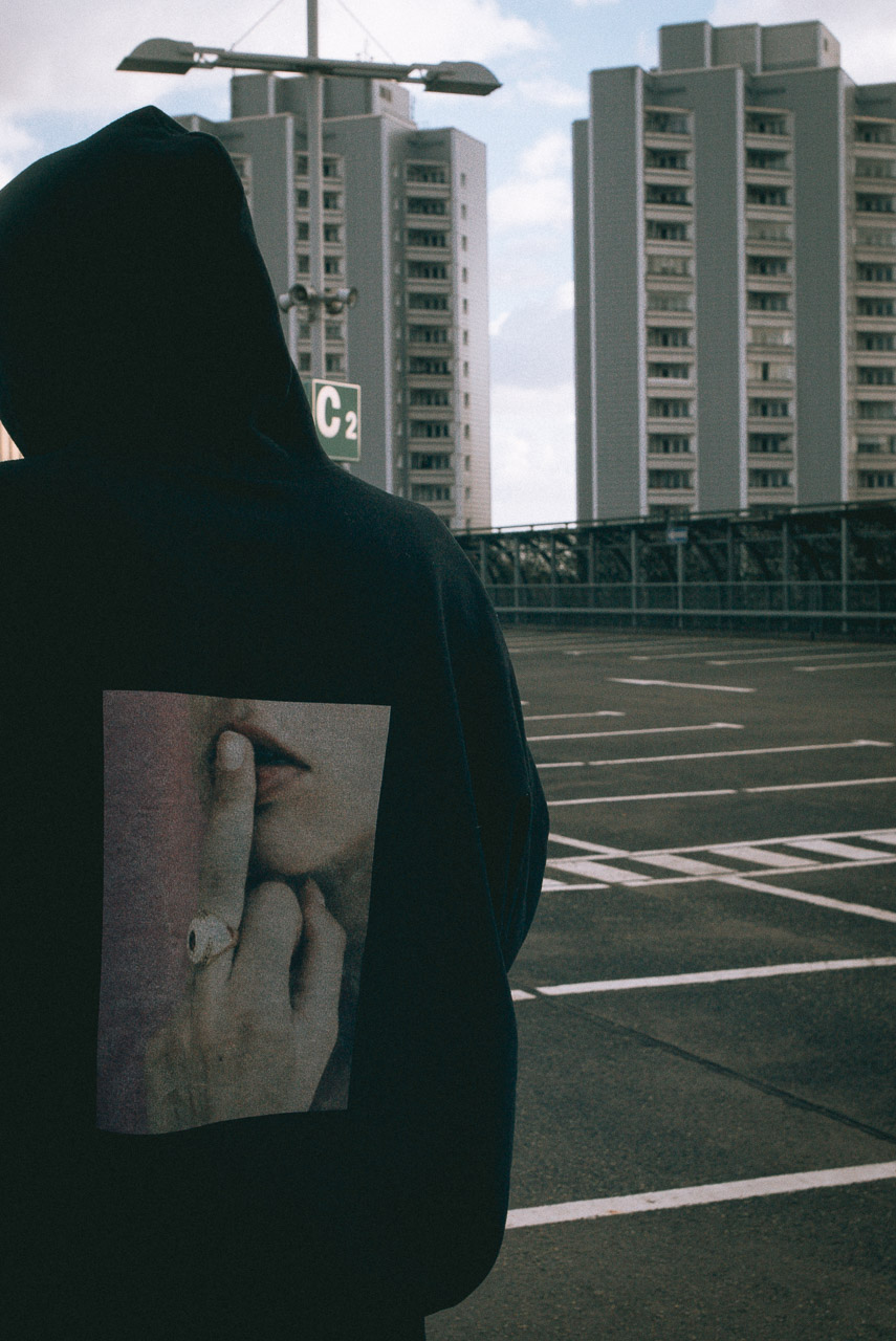
That is why you need those other outputs like video, so you have more freedom still, we always try to keep an open mind when it comes to those two things. Then again references can be fun! We are doing the Muska thing in this collection which is ironic because he is moving away from skateboarding into the realm of art. At the same time, it’s fun because some will get it immediately and other will be like Muska who? First, we wanted to call that the noseslide stuff but this works better.

So for the Muska thing the colors were set but how do you guys choose the other colors that make up a collection?
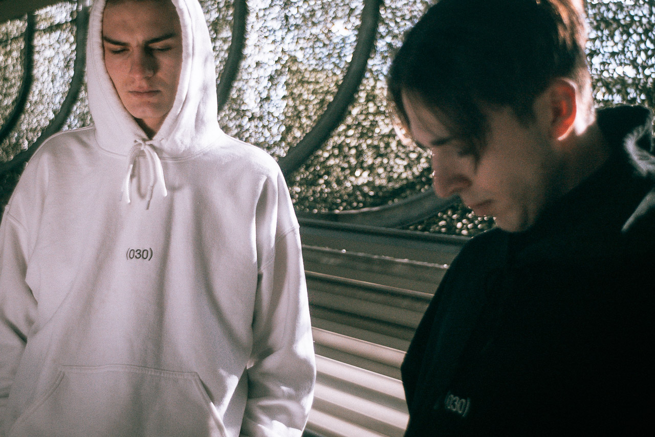
In the beginning, we worked a lot with black and white, which are art references, we also had a red dot in reference to the selling of art but then Free skateboard mag came about and we decided to drop it. But as we progressed there was so much black and white being used in skateboarding that we felt like we wanted to work with colors more. A lot of the colors we use come from paintings and looking at things we want to use color tones that are not that in your face, we want to have it flow nicely together and combine that into something you would want to wear, even as a grown up.

Even as a grown up (laughs)!
To me, pink for instance has always been the opposite of what is black & white which are like “hardcore cool” and pink transforms things into something else and that is interesting. For a while, though I was doubting the pink on Sarah’s board because it seems almost cliché because she is a female but it actually worked well and she liked it. To me, the pink that we used doesn’t represent gender it represents something softer.

We are a group of people that hang out together and skate together but at the same time, we don’t want to push that part as a “cool” thing. It is not like ‘we are the shit, fuck everybody else’, it is more like a love thing and to me, pink represents that.

Alright! So since you are definitely into balancing things out well, how did you choose what type of clothes to make and what kind of fit to use?
I look at a lot of fashion outside of the skateboarding realm and as I said before that connects back to the point I made earlier that influence can come from different directions. At the same time, we still make a lot of basics as well. At the same time, I would like the company to grow so I can do some more obscure stuff as well. As for the fit, we spent a lot of time finding the right fit but it’s hard cause the next color way can have a different fit.

What about the boards?
As far as the boards go there is a lot to choose from! But the thing is people have their own preferences, they always say what about that shape what about this? I like them how we make them now and a lot of people do so why change that?

So what kind of people would you love to collaborate with?
Karin Mamma Andersson who is one of the biggest Swedish painters that is totally removed from skateboarding I wouldn’t necessarily want to do that Mark Gonzales guest board. I like something that is so far out that it becomes interesting.

Catalog photos by Nickolina Knapp
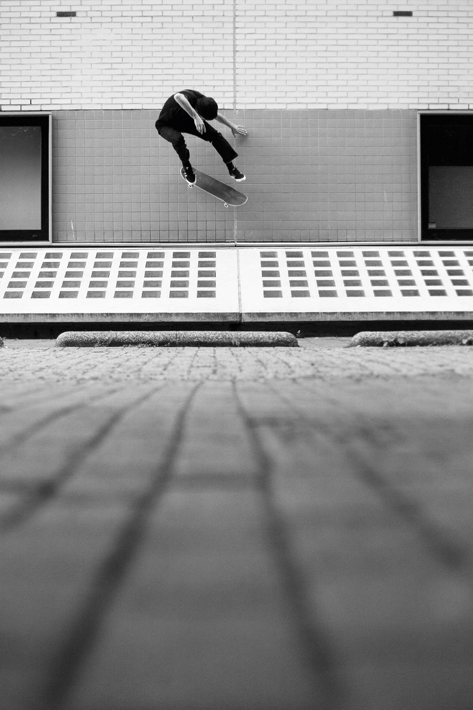
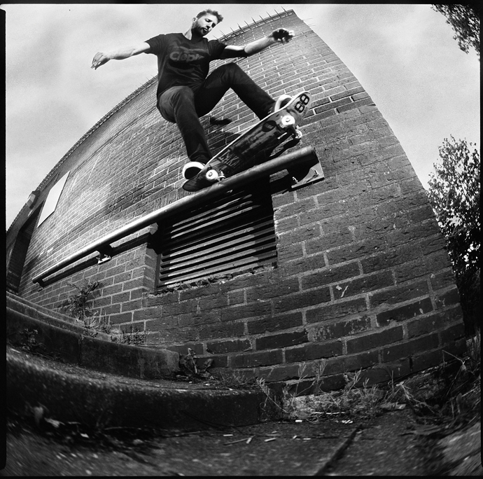
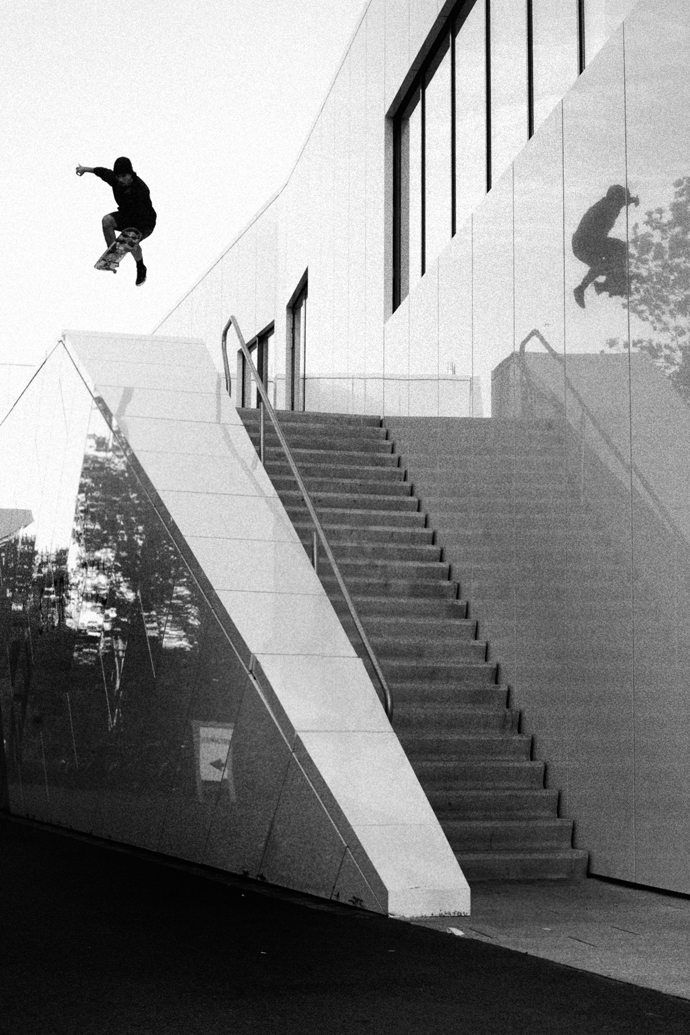
Lifestyle photos by Robin Pailler

For their project inside the Museum of Modern Art in Malmö, Sweden, the Poetic Collective asked themselves two central questions.

What happens if we strip away everything
but the actual act of skateboarding?

What happens if we put it in a space where we
highlight the expression and movement as any other artform?

This video is the result of those questions being put to the test, the answers are not given to you in words and even the music was handmade for this clip so one can say that the answers to those two questions are being presented to you in a “mood”. Enjoy!

During the last 6 months David Lindberg has been working on this new skateboard / art project with Icelandic skater Sigurdur Páll Pálsson. David informed us that Siggi is newly on flow for Poetic Collective and after seeing this very very nice section it might even be time for a bump up.

https://vimeo.com/168599212

https://vimeo.com/164052535

Berlin based and inspired brand (nulldreinull) presents their new short about a vivid generation of young creatives.

„THIS IS NOT A LOOKBOOK“

Realised by Modest Department
Starring (nulldreinull) founder Steffen Grap and friends

DSC09204

DSC09275

If you do not know about the Far East Skate Network also known as FESN you have been sleeping under a rock! FESN has played a major role in pushing the Japanese skate scene.

They helped create Overground Broadcasting a 2008 skatefilm that has some prophetic parts. Most of Takahiro’s projects show you a different frame of reference, connecting colors, actions and images in a new way.

Ever since Magenta entered the skate scene Takahiro has started to frequent our western screens more and more, one thing always stands out, his sign! It says: MY FRIEND. From the moment you come in contact with the sign and the message it carries you start to think. So when we had the pleasure to exchange e-mails with Mr. Morita we could not resist to ask him about his moving message:

How did you get the idea for the MY FRIEND sign and do you travel around the world with it or do you make them on location?

My answer is the following:

I think my skating represents a message to the society around me.
I think my tricks, speed and my style of skating could be the message to skaters and non-skaters.
There is a thing that I realized through filming for years.
I realized that I have affected skaters that I’ve never met to a certain degree, by filming my friends and getting the footage out there.

And by making skate videos, people that I had never met started to visit me.
And they became my friends.

A person that I respect once told me, “Be nice to friends, then that energy will become the power to make the world better.”
The MY FRIEND sign is for the person who’s reading it.
So it’s not MY FRIENDS, it’s MY FRIEND.

PS – The MY FRIEND sign can be folded up and I always bring it with me every time I travel.

By Roland Hoogwater
Photos by Yoshiro Higai (cover) & Hisashi Nagasu (MY FRIEND)

My Friend

Yesterday you had the chance to learn a lot about Dutch Light – now it’s time to see Dennis Laass, Tjark Thielker, Niklas Speer von Cappeln and Jan Hoffmann in action. Here’s the clip from Cleptomanicx’ trip to Holland. Filmed and edited by Lucas Fiederling – press play:

Dutch Light is a phenomenon that has its origins in 19th-century literature. Historians started writing about this special light that only seemed to exist in The Netherlands. It was widely believed that the phenomenon first showed up in 17th-century Dutch landscape paintings. As it turned out, the 17th-century artists who painted those pictures often also worked on other assignments that fit in with their artistic practice. When researching these artists more closely, historians discovered that most of these artists were also employed by the government. They had been assigned to study the Dutch landscape with the help of early measuring tools. And among many things, these studies led to some of the first maps showing the country as it is today.

DennisLaass-siderock-Groningen2
Dennis Laass – Siderock

The governmental research missions also gave the artists an opportunity to study the landscape in several aspects. During these studies, they experienced something special:
It was a distinct kind of light, not the bright equalizing sort of light that artists in the south of Europe were painting, neither was it comparable to the ever-changing light that one might find in Great Britain or Scandinavia. Intrigued by the phenomenon, they came up with an explanation: Because most of the Netherlands sits below sea level, it was first believed that the effect was created by the sea moving in and out of the land.

TjarkThielker-ollie up-kickflipwallride-Groningen
Tjark Thielker – Ollie Up Kickflip Wallride

When word of Dutch Light spread through 19th-century writings, artists from all over the globe became enchanted by the light and came to the Netherlands to capture it in their paintings. These pilgrimages gave artists the perspective that it was not just the sea causing the effect, it was mainly the fact that the water was everywhere at once. And on top of that, it needed to be accompanied by sunlight. When these conditions were met, it created a “double landscape,” which magnified all things in its presence. Trees seemed to become greener, the sky looked especially blue and the red brick buildings seemed illuminated for a brief moment.

NiklasSpeervonCappeln-bs5-0-Groningen-1(xl)
Niklas Speer von Cappeln – BS 5-O

Unfortunately, “Hollands Licht” – or Dutch Light – is not easily found, especially in the ever-changing Dutch climate. Some of you who might have traveled to this fair country might have experienced days where grey clouds packed with rain, hail, or snow have been almost instantly replaced by sunlight. This is because most of the country is flat, and the wind is free to bring on rapid change. When the right conditions are met and if you are lucky, you might be able to see some Dutch Light.

Cleptomanicx took a group of their finest riders – Dennis Laass, Tjark Thielker, Niklass Speer von Cappeln and Jan Hoffmann – to the Dutch city of Groningen, to try and capture this fleeting moment when all the conditions are just right to create something special.

JanHoffmann-beanplant-Groningen
Jan Hoffmann – Beanplant

by Roland Hoogwater
Photos: Friedjof Feye